STEP ONE: Begin by opening a new 12 X 12 page insert photo you want to work with try and use a image that has a simple background. I’m using a photo of my grand-daughter Sydney at the pumpkin patch last year (not such a simple background). It really is best if you use a more uncluttered photo for better results.
 STEP TWO: Activate your photo layer by clicking on it. Choose Edit>Define Pattern in the dialog box that comes up and click OK to save this image as a stamp, we will use it later.
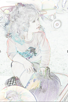
 STEP THREE: In the Layers panel, click and drag Layer 2 (photo) onto the Create a New Layer icon to create a duplicate layer, this is your Layer 2 copy. Then go under the Filter menu, under Stylize, and select Find Edges. This will give you a quick line drawing effect that we will use to build our painting.
 STEP FOUR: Click on Layer 2 copy “Eye Icon” to hide this image. Choose what color you want for your background, sometimes it’s good to just sample a color from your original picture. Click on Layer 1, Press Option-Delete (PC:Alt-Backspace) to fill this layer with the Foreground color you chose. Move this layer under Layer 2 copy.
 STEP FIVE: With Layer 1 still selected, go under the Filter menu, under Texture, and choose Texturizer. Set the Texture type to Canvas, Scaling to 100%, Relief to 3, and the Light source to Top. Click OK.
 STEP SIX: Click the empty box to the left of the Layer 2 to turn on the visibility, then click the layer to select it in the Layers panel, change the blend mode to Multiply. This will render the white invisible and blend the black line drawing with the colored background.

 STEP SEVEN: This is the FUN part. Press and hold the command (PC Ctrl) key and click the Create a New Layer icon to place a new layer (Layer 3) beneath the Layer 2 copy. Change the blend mode of this layer to Hard Light.
 STEP EIGHT: Choose the Pattern Stamp Tool, which is nested under the Clone Stamp tool in the Toolbox. In the Options Bar, click the Pattern Picker to open the menu. Locate the image you defined in Step One (It should be on the bottom of the list) and select it. Move the other end of the Options Bar and choose a small, soft-edged brush.

 STEP NINE: Now start painting the image. It should be aligned because you’re in the same working document. Paint the areas that you want to look painted and you’ll notice immediately that it does look painted. This is because of the way the Pattern Stamp tool is blending with each layer through the blend modes: Keep painting but leave some lines from the Find Edges filter in a few areas so the image has a unfinished look to it. If you paint to much in an area you can use your eraser to clean it up some and return the line work as needed to increase the painterly look. Since this one is a particularly busy line picture I went to my Layer 2 copy and erased the lines I didn’t want to show. I softened the straight edges by using a brush and erasing the edge lines. I didn’t like the bold look of the lines so I erased most of them and decreased the opacity a bit to fade them out. I’m sure it will depend on what kind of picture you used. That is why less is better in your picture choice. In this example I left part of the bottom half unpainted showing some of the line work.


 STEP TEN: Now let’s fade the drawing at the bottom with a quick layer mask. Select the Layer 2 copy and click the Add Layer Mask icon at the bottom of the Layers panel. Grab the Gradient tool and press X to set the Foreground color to black. In the Options Bar, click the Gradient Editor and select the Foreground to Transparent gradient and the Linear gradient. Starting at the bottom of the image, click and drag the gradient upward. This will give you a nice fade without erasing any data.


 STEP ELEVEN: The last thing you want to do is add a little subtle highlight effect to make your background pop a little. Click the Create a New Layer icon and place the new layer (Layer 4) between Layer 1 and Layer 3. Set the layer blend mode to Screen. With the Gradient tool selected, go to the Options Bar and choose the Radial Gradient. Beginning in the center of the painting, click and drag the gradient upward going a little past the image. As you can see you have a glow behind your subject, the image itself is also lighted a bit because it is slightly transport. If you think you want it a little lighter just dublicate the layer. Finally add any wordart, title work, elements, special effects to your layout and call it done.

 STEP TWELVE – for one of the effects I did use a brush to paint a texture behind the subject (I also used this to do some of my erasing on the bottom of the photo). Create new layer (Layer 5) insert it above Layer 4. I used a brush from Sydnee Nuckles called Painted. Chose a light buff color and added the stroke to add a bit more texture.

 STEP THIRTEEN: Optional – if you think your linework that is showing is too strong you can lower the opacity. Click on Layer 2 copy sketch, lower the Opacity, this will soften the lines and even brighten your photo a bit.


Finished Layout using this painting technique a little bit different then the samples because I painted all areas and didn't leave the bottom unpainted!

I would love to get some feedback on this, please leave me a comment. Thanks for looking!
13 comments:
This looks AWESOME!! Love it and your layout is soooo cool! WoW!!!
GREAT Tutorial, Frani!!!
Love it!!
I love your layouts on here too!
Spectacular work!
Tina
Thank you, Frani, my goodness, what a fantastic blog you have and the tutorial rocks! You are lightening fast!
~francine
That is a beautifully explicit tutorial Frani! I'll have to see what I can do with it in PSE.
Fran
I love your blog and will be checking back again - and again :)
J
Wonderful tutorial! I'm going to bookmark it so I can try it sometime soon! Hope it works in PSE.
Shared on my blog today. http://cookingmylife.blogspot.com/2011/10/tuesday-tutorial-digital-painting.html
Thank you for this tutorial, I'll try to put it into practice
Great tutorial.
Cann't go wrong anymore ;)
Thanks!
ViVre
Awesome tutorial, Frani! I will surely give it a try.
I would love to be in a class with you as an instructor. This tutorial is just fantastic and so wondrously spelled out with visuals for proper effect. Thank you for placing this on your blog so that we could benefit from your so professional tutorial design. I will be checking back to see if you had any more tutorials, especially for an extraction's proper blending into an effective background. Kudos! ;)
Many thanks for sharing this great tutorial.
Loved this tutorial and definitely want to try this!! Thanks so much for posting this....I'm bookmarking it!!
Post a Comment