Showing posts with label Tutorial. Show all posts

Sunday, July 19, 2015

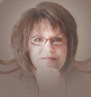
Line Sketch

Tutorial created using Photoshop C6


1.       Choose the photo you want to work with.  For this tutorial I choose the photo I used for my avatar. Start by duplicating the photo twice by pressing Ctrl-J two times.


2.       With the top layer (Layer 1 copy) active in the layers panel, go to Filter>Blur>Smart Blur.   We’re not really creating a blur here but rather creating the line-drawing effect.  Go to the Mode drop down menu at the bottom of the Smart Blur dialog and choose Edge Only.  Set the Quality drop-down menu to High.  Then, move the Radius and Threshold sliders to refine how much line detail you want.  For this photo I set the Radius to 2.5 and the Threshold to 25.  Click OK


Note: What you want to achieve is the amount of outline you want, you can go more by decreasing the Threshold and Increasing the Radius.  Just play around with it until you get the look you want.


3.      Now we need to extract the line drawing from the layer so we can change the line color.  Go to the Channels panel (Window>Channels), hold down the Ctrl key, and click on the RGB channel thumbnail.  This will load the luminosity of the image as a selection.  Since the image is black and white, it will ignore black and load just the white area.


  • Photoshop Element users don’t have The Channels function so replace step 3 with these instructions.
  •  Layer1 copy Ctrl I to inverse (you should have a white background with black outlines. Go to  Select>Color Range
  • Select: Highlights
  • Selection Preview: White Matte
  • Click okay
  • You should have the marching ants on the line work, click on the delete button and you white background should be removed.

4.       With the selection active, go back to the layer panel and click the Create a New Layer icon at the bottom of the Layers panel to create a new blank layer (Layer2).  Click the Eye icon to the left of the original line drawing layer (Layer 1 copy) to hide it.   Then press Shift –Backspace to bring up the Fill Dialog.  Choose Black from the Use drop-down menu, and click OK.  Press Ctrl-D to deselect.  The line-drawing effect over the original photo creates an interesting result.


5.       Click on the original Background in the Layers panel to make it active. And go to Filter>Blur>Average.  It will look at the overall image and generate a color fill based on the average color tone of the entire image.  Usually the result will look good, but experiment with other colors to what works best for your image.


6.       Activate the duplicate layer (Layer 1) that still contains the original image.  Hold down the Alt key and click the Add Layer Mask icon (circle in a square) at the bottom of the Layers panel.  This will create a layer mask filled with black, hiding the entire layer.


7.       Select the Gradient tool (G).  Press D to set the Foreground color to white.  Click the down-facing arrow next to the gradient preview in the Options Bar to open the Gradient Picker and choose the Foreground to Transparent gradient. To the right of the gradient preview in the Options Bar, choose the Radial Gradient icon.


8.       Click to start the gradient in the area of the image where the main subject is, then drag toward the bottom of the image.  (I started my selection at the now base of my glasses and ended just below my hand.) This will reveal the image in the where you started dragging and fade away the edges to reveal a portion of the original photo.


9.       Since we want the image to transition from a photo to a line drawing, we need to mask the line drawing area in the middle.  Select the layer containing the line drawing (Layer 2) and click the Add Layer Mask icon again (but this time without holding down Alt).  This will add a layer mask filled with white, revealing the entire layer.

Press X until the Foreground color is set to black.  Using the Gradient tool again, draw the gradient in the same area and distance as you did in the previous step.  Now as the photo fades out, the line drawing fades in.


10.   Let’s slightly change the color of the outline.  Click the layer thumbnail for the line drawing layer (Layer 2) to make the layer active and not the mask.  Click the Lock Transparent Pixels icon (checkerboard) at the top of the Layers panel.  Click the foreground color swatch at the bottom of the toolbox, select a color in the Color Picker (I went with a brown shade) and click OK.  Press Alt-Backspace to fill the lines with your chosen color.


To finish the effect, I added some texture to the background color.  Activate the Background layer and go to Filter>Filter Gallery>Texturizer.  Set the Texture drop-down menu to Sandstone, Scaling to 149, Relief to 6, and click OK.


Click on layer one photo (not the mask), go to Filter>Filter Gallery>Texturizer keep the same settings as you had with background texture click okay, go back into Filter Gallery to add some additional texture, this time instead of Texturizer in the drop down, choose Rough Pastel.  For this photo I used Stroke Length 28, Stroke Detail 20, Texture Canvas, Scaling 76, Relief 12.  Again each photo may use different settings, just play around with them until you get the desired results.


11.   For the final step – do some clean-up on the line work. Go to Layer 2, click on the mask, using a soft brush start cleaning up some of the more erratic lines to make it more realistic, or use your gradient tool once again to fade out certain areas.  For this photo I wanted to fade the bottom portion a bit more, so I started the gradient from the bottom of the photo and went upward.


You can also turn off the line layer and get a soft portrait effect.  Have fun with this and try out different filters.  Make this your own.


Sunday, October 16, 2011

Something Wicked Tutorial

Something Wicked Tutorial using CS5

Thanks for coming by and checking out my lastest tutorial, thought you would enjoy a creepy freaky Halloween one....let me know what you think!
STEP ONE: Open image you want to work with, duplicate image.

STEP TWO: Click on your Background copy layer in the layers panel to make it your active layer. Press Ctrl-L to bring up the Levels dialog. Move the Shadow Input adjustment slider (the black one on the left side) toward the right to darken the shadows then click and drag the Midtone Input (the gray slider in the center) a little to the right to darken the midtones. Move the Highlight Output adjustment slider (the white one on the bottom right) toward the left to slightly darken the highlight areas. Click OK.

STEP THREE: Desaturate the image by pressing Ctrl-shift U, then press Ctrl U to bring up the Hue / Saturation dialog. Turn on the Colorize checkbox, enter Hue (85), Saturation (35), Lightness (-52), and click OK.
Note: The above settings are what I used for my photo, you may have to tweak yours to get just the right shade of color and saturation you prefer. Just play around with the settings until you get what you want.

STEP FOUR: Because the eyes look so washed out I want to give them a little pop at this point. Duplicate your layer, choose your dodge tool, set exposure to 30% and use a soft brush small enough to work your area. Brush over what used to be the white area of the eyes to lighten them up a bit. Also brush the catch lights in pupil of the eye, making them brighter. Make your brush slightly bigger to fit the iris of the eye, this will brighten them slightly. Now choose your burn tool, I want to darken a few areas of the eye just slightly. Keep the soft brush and set your exposure to about 10%. With a smaller size brush ( I used 5 for this picture) outline the dark outline of the iris and outline the lash area (sorta like putting on eye liner). Now for the finishing step, choose your sharpen tool set the strength to about 50%, brush around the iris and pupil once. This will help make the eyes pop a bit more…..
 Note: You can skip step four if you so choose. I only did this step because my picture quality was lacking and I wanted the eyes to stand out a bit more.

STEP FIVE: Duplicate layer, choose the Burn tool. Go to the Options bar, choose Midtones for Range, and enter 30% for Exposure, Using a large, soft-edged brush (I used 75 for the top of eye area and decreased the size to 35 for under the eye area. Just play around with the sizes to see what works for you), darken the areas around the eyes, cheeks and side of nose and any other areas you may wanted to darken. Some areas I went over a second time to darken more. For the last step I changed my mode to Shadow and used brush size to 25 and did a quick sweep around the eye area to give a darker smoky look. Again just play around with it to get it to look the way you want.

STEP SIX: Duplicate layer, choose the Dodge tool. In the Options Bar, choose Midtones for Range, and enter 30% for Exposure. Use a large, soft-edged brush to lighten the cheek nose and lip highlights.

STEP SEVEN: Add new layer, choose a lip color, I choose orange. Use a small, soft-edged brush at about a 26 Opacity to add color to lips. You just want the color to barely show up. Lower the opacity even more on your layers pallet if it still is too strong. On the layer below your new layer, choose the Burn tool, change the range to Shadows, Exposure 13% and use a soft brush size 10. Add just a smidge of a shadow to the area below the upper lip to define the area a bit more.
STEP EIGHT: Open up a peeling paint image, drag it onto your image. Rotate it 90 degrees.

STEP NINE: Ctrl – shift – U to desaturate the peeling paint and change blend mode to Multiply. Now, press Ctrl L to bring up your Levels dialog. Drag the Highlight input Levels slider toward the left until it reads 202, Click OK.

Note: If you want to cover more space on your image, duplicate layer and move to another area you might want to cover. Here is an image of 4 sections, merge these layers together before changing your Levels.

STEP TEN: Click on Add Layer Mask icon (circle in a square) at the bottom of the Layers panel. Choose the brush tool and use a small, soft-edged brush to mask out the hard edges and take out any areas you don’t want the cracks on, especially in the inside of the eye area.

STEP ELEVEN: To intensify the appearance of the cracks, duplicate Layer (peeling paint layer) and lower the opacity until you like what you see…..

Your Done!
Get your free peeling paint texture Urban Dirty Free texture stock photography!

Sunday, October 2, 2011

Digital Painting Tutorial

A couple of my fellow scrappers were asking how to achieve a "Lighting Effect" they had seen on several layouts.  I started playing with a tutorial by Corey Barker called Illustration Effect on Photos, I used parts of it and modified it to fit my own scrapping needs.  This is what I came up with.

STEP ONE: Begin by opening a new 12 X 12 page insert photo you want to work with try and use a image that has a simple background. I’m using a photo of my grand-daughter Sydney at the pumpkin patch last year (not such a simple background). It really is best if you use a more uncluttered photo for better results.

STEP TWO: Activate your photo layer by clicking on it. Choose Edit>Define Pattern in the dialog box that comes up and click OK to save this image as a stamp, we will use it later.
STEP THREE: In the Layers panel, click and drag Layer 2 (photo) onto the Create a New Layer icon to create a duplicate layer, this is your Layer 2 copy. Then go under the Filter menu, under Stylize, and select Find Edges. This will give you a quick line drawing effect that we will use to build our painting.

STEP FOUR: Click on Layer 2 copy “Eye Icon” to hide this image. Choose what color you want for your background, sometimes it’s good to just sample a color from your original picture. Click on Layer 1, Press Option-Delete (PC:Alt-Backspace) to fill this layer with the Foreground color you chose. Move this layer under Layer 2 copy.
STEP FIVE: With Layer 1 still selected, go under the Filter menu, under Texture, and choose Texturizer. Set the Texture type to Canvas, Scaling to 100%, Relief to 3, and the Light source to Top. Click OK.
STEP SIX: Click the empty box to the left of the Layer 2 to turn on the visibility, then click the layer to select it in the Layers panel, change the blend mode to Multiply. This will render the white invisible and blend the black line drawing with the colored background.

STEP SEVEN: This is the FUN part. Press and hold the command (PC Ctrl) key and click the Create a New Layer icon to place a new layer (Layer 3) beneath the Layer 2 copy. Change the blend mode of this layer to Hard Light.
STEP EIGHT: Choose the Pattern Stamp Tool, which is nested under the Clone Stamp tool in the Toolbox. In the Options Bar, click the Pattern Picker to open the menu. Locate the image you defined in Step One (It should be on the bottom of the list) and select it. Move the other end of the Options Bar and choose a small, soft-edged brush.

STEP NINE: Now start painting the image. It should be aligned because you’re in the same working document. Paint the areas that you want to look painted and you’ll notice immediately that it does look painted. This is because of the way the Pattern Stamp tool is blending with each layer through the blend modes: Keep painting but leave some lines from the Find Edges filter in a few areas so the image has a unfinished look to it. If you paint to much in an area you can use your eraser to clean it up some and return the line work as needed to increase the painterly look. Since this one is a particularly busy line picture I went to my Layer 2 copy and erased the lines I didn’t want to show. I softened the straight edges by using a brush and erasing the edge lines. I didn’t like the bold look of the lines so I erased most of them and decreased the opacity a bit to fade them out. I’m sure it will depend on what kind of picture you used. That is why less is better in your picture choice. In this example I left part of the bottom half unpainted showing some of the line work.


STEP TEN: Now let’s fade the drawing at the bottom with a quick layer mask. Select the Layer 2 copy and click the Add Layer Mask icon at the bottom of the Layers panel. Grab the Gradient tool and press X to set the Foreground color to black. In the Options Bar, click the Gradient Editor and select the Foreground to Transparent gradient and the Linear gradient. Starting at the bottom of the image, click and drag the gradient upward. This will give you a nice fade without erasing any data.


STEP ELEVEN: The last thing you want to do is add a little subtle highlight effect to make your background pop a little. Click the Create a New Layer icon and place the new layer (Layer 4) between Layer 1 and Layer 3. Set the layer blend mode to Screen. With the Gradient tool selected, go to the Options Bar and choose the Radial Gradient. Beginning in the center of the painting, click and drag the gradient upward going a little past the image. As you can see you have a glow behind your subject, the image itself is also lighted a bit because it is slightly transport. If you think you want it a little lighter just dublicate the layer. Finally add any wordart, title work, elements, special effects to your layout and call it done.


STEP TWELVE – for one of the effects I did use a brush to paint a texture behind the subject (I also used this to do some of my erasing on the bottom of the photo). Create new layer (Layer 5) insert it above Layer 4. I used a brush from Sydnee Nuckles called Painted. Chose a light buff color and added the stroke to add a bit more texture.


STEP THIRTEEN: Optional – if you think your linework that is showing is too strong you can lower the opacity. Click on Layer 2 copy sketch, lower the Opacity, this will soften the lines and even brighten your photo a bit.


Finished Layout using this painting technique a little bit different then the samples because I painted all areas and didn't leave the bottom unpainted!


I would love to get some feedback on this, please leave me a comment.  Thanks for looking!